On a recent The Weeds podcast, Matt Yglesias talked with Binyamin Applebaum about “how economists took over the world”, based on Applebaum’s recent book. Midway through, Applebaum told a fascinating story about how business leaders often get their forecasts about government regulations/interventions wrong. During the Great Depression, as part of the New Deal, President Roosevelt wanted to create the SEC and force companies to release audited financial statements. Apparently, part of the roaring 20s including gross accounting fraud, including create false prospectuses and financial documents.
Naturally, business folks and economist types of the time said these onerous requirements would destroy investing/capitalism.
But they didn’t! In fact, the value created from audited financial statements is arguably one of the greatest value creating regulations in financial history.
Why tell this story in an article ostensibly about Netflix? First, it’s a great example of how regulations make things better for society, despite the cries of protest from business.
Second, even now, a lot of financial statements are currently pretty rubbish. Sorry “suboptimal” in business parlance. What they lack in substance, they make up in heft; they are long, filled with hundreds of pages of legal jargon designed to obscure and CYA, but they still don’t tell you that much.
When you pull up the financials of a company like Google—for example—you discover that they only break out the operating segment information for two businesses: Google and moonshots “Other Bets”. What? Why not break out Youtube and Gmail and Waze? As Matt Stoller informed me, Google runs 8 businesses with 1 billion or more users; they shouldn’t be broken out by themselves? (Google does provide more granularity on revenue sources, but still only four revenue streams!)
Let’s look at Amazon: they run Prime Video, Music, Games, Channels, Twitch, and Comixology. Could they make a “media enterprises” business segment and share operating performance for all those companies combined?
Yep! And guess what, it would be fairly easy to do.
Which brings us to Netflix. They too have tried to minimize the numbers they provide over time. Worse, every so often they change their definitions, and stop reporting old numbers. Which makes an enterprise like the one I pursued last week much more fraught. To help build the table with subscriber numbers, I had to go through essentially 20 years of Netflix annual reports to figure out how they defined subscriber totals every year. Fortunately, this deep dive taught me a lot about Netflix, and could help you understand their history a bit better.
Today, I’ll tell you what I learned, including the different definitions of subscribers, how they have evolved over time and the two pieces of data I’d still love to see.
The Six Definitions Netflix Has Used for Subscribers in the US
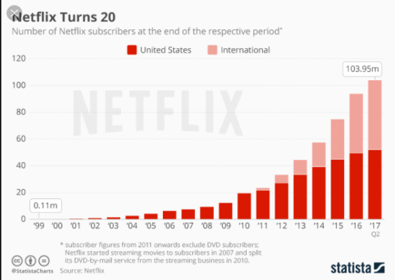
As I mentioned last week, here’s an example from Statista of a chart of Netflix global subscribers.

Here’s another one. Here’s another one from my archives in Statista that doesn’t match my numbers:

Meanwhile, most of the other charts I found with Netflix started in 2012. Which seems like an odd decision. Since I don’t like uncertainty in my estimates, I pulled the data myself for my article applying Bass Diffusion to Netflix. (I had previously done this back in March for this Decider article.)
As I churned through the financial docs, three big categories leapt out at me. Netflix has highlighted different numbers as their “top line” subscriber number, which news reports usually echo. For instance, up until the end of last year, Netflix reported “total subscribers” inluding free-trial and paid subscribers together. Now they’re only emphasizing paid subscribers. When they made the change, some folks thought their numbers had declined. Anyways, the three big areas I see are:
– Location: US, International or Global: Pretty self explanatory, and Netflix has combined these to report “global”.
– Paid vs Free-Trials: I tend toward “paid” as my preference because it means the people have actually committed to the product and aren’t just sampling. (Netflix changed last year to focusing on paid vs free-trials, which is what they had reported before.)
– DVD vs Streaming: Before 2007, you could only rent DVDs through Netflix. After 2007, you could rent DVD or stream content or do both. Before 2011 a subscription paid for both, then it didn’t.
The only challenge is some of those categories are mutually exclusive (paid vs free trial) and some aren’t (DVD vs streaming). So I made a table to simplify it in my head.

The key is the “unique” number versus total subscribers when it comes to DVDs and streaming. For a short period, Netflix gave the total numbers, even when unique was more accurate. Nowadays, for the record, Netflix just gives streaming as DVD subscriptions decline.
Combining the Definitions in One Chart
Once I had my definitions, I could then go to pull Netflix subscribers by year and categorize the data. This way I could keep as much “like-to-like” as possible.

These are all Netflix’s customers by the best definition of subscriber I could find going back to their launch in the United States only. Someday, I’ll repeat the entire exercise for international subscribers, and we should have slightly fewer definitions because Netflix didn’t start global growth until its move into Canada in 2010.
This is why most charts you do find on Netflix on go back to 2012, after they’d been streaming for 5 years. They changed to “streaming only in the US” in 2012, so most charts throw out everything before then for simplicity.
Calculating Subscribers Over Time
All Subscribers
For my Bass Diffusion model with Netflix, I wanted two different calculations. First, all Netflix’s subscribers period. Except for their early time period, I could usually find the Paid and US numbers. Again, focusing on paying customers. However, as this table shows, the DVD vs streaming vs uniques vs “streamers plus DVD subscribers” numbers changed over time. So I made my best call and got this:
 Ah, notice that from 2013 to present I have “calculations” of higher total subscribers than streamers? What happened? Well, even after Qwickster debacle of 2011, Netflix eventually did split their DVD and streaming businesses. And that purple column is the customers in the US who still subscribe to DVDs. 2.7 million of them. (Or 1% of the US population or 2.5% of households!)
My calculation here is this—and it’s an assumption, but I had to to get all subscribers and stay apples-to-apples—-was that in 2011 and 2012 the number of DVD customers who only used DVDs was 25% and 27%. My assumption is that tiny growth rate continued, so the percentage of DVD only customers was slightly growing. Since the DVD business is shrinking overall, well this number is shrinking too. (Though the rate of decline is slowing.) That got me this data…

…and I just added these streaming only customers to the DVD only customers.
Streamers
On the other side, from 2011 to 2018 and beyond, Netflix told us how many paid, US streaming subscribers they had. Easy. But from 2007 to 2010, they didn’t, because they either told us unique subscribers or streamers plus DVDs. Honestly, when they made the Qwickster switch, it was a mess in the financial documents. Trying to sync up 2010 to 2011 is really where my eyes started to bleed and where I had to start color coding my Excel.
The key was trying to estimate from 2007 to 2010 how many folks were using streaming or “paying” for streaming. I know in 2011 and 2012 that the streaming-only segment was 88% and 92% respectively, but I can’t just flat line this down because that’s not how adoption works. Instead, I assumed it grew aggressively, going from 25% of customers in 2007 and then I had it grow 25%, 50% and 75% respectively. That left me with this giant table combined:

Without any data to inform these estimates, this is my biggest assumption. In fact, looking at the ideal bass model in hindsight, well, I have a feeling that I could have bumped up the early streaming adoption numbers. Look at the red square.

That’s the 2007-2009 time period, so clearly the model suggest that’s closer to actual performance. Since Netflix never told us how many streamers they had using the service back then, we’ll never know.
That’s probably more than you wanted to know about Netflix and how they calculated their subscribers over time, but as I’ve said, I’ve seen some subscriber tables mess it up. And this is the best description of the data I know. If you want a chart…fine.

Slight caveat: 2019 is in progress, which is why the growth is much slower.
Data I’d Still Love
Given that the streaming wars will start in earnest soon, having reliable data is better for everyone. As my financial anecdote above described. And Netflix is sort of a case study in hiding some data that could be useful. At the end of the day, the question is, “How many subscribers will Netflix have/keep/gain?” Two pieces of information would seem super useful in calculating those.
And while I’m picking on Netflix, honestly Amazon, Youtube, Disney, CBS, and Apple should have to release these numbers too. The rule of thumb from the FCC should be, “If you spend more than $1 billion on content, release your subscriber numbers and these pieces of data too.”
Data 1: Gross and Net Subscriber Adds
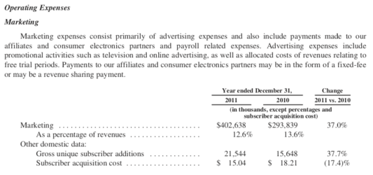
For two glorious years—2010 and 2011—Netflix released not just how many subscribers they added each year on net (meaning the difference from the start to the end) but they actually told us how many people signed up period, the “gross” number. They buried this in the marketing section.

At some point, they deprecated this saying that it wasn’t actually correlated with subscriber growth, but if they had kept releasing the data, couldn’t we investors/observers have made that decision for ourselves? This data would be very useful to judge the impact of their marketing spend. If we had even one more year of data I’d start pulling at the data to look for lessons in churn. As it is now, we just have to trust them.
Data 2: Monthly Active Users
Does a customer use a streaming service? That seems fairly important to understand how much customers actually love a given subscription. If they use it, presumably they like the content and when prices go up they’re more likely to stay. If they don’t use it, in the next recession that subscription could hit the chopping block.
I wrote a lot about MAUs when I made my forecast back in January. In short, my personal experience and just basic logic imply that active users are better than “inactive” users. I explored this more in my article on MoviePass. It’s a very key number in subscription service and also implies the number of customers who are losing value on their subscription. Unlike insurance—which customers need to have for random events—if you don’t use a media subscription you really shouldn’t subscribe to it.
Unfortunately, with Netflix we have no idea what these numbers are.

